YTABIL INC. | Personal Branding Design
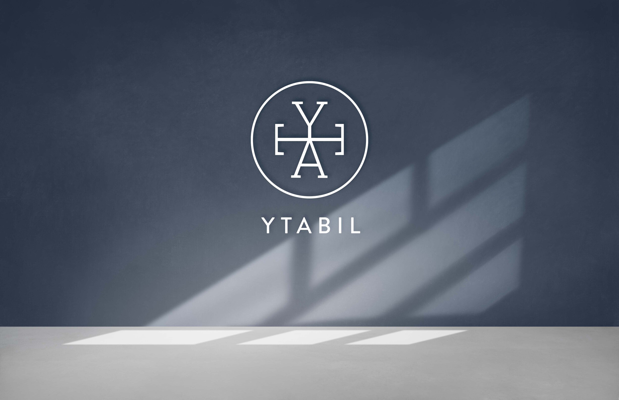
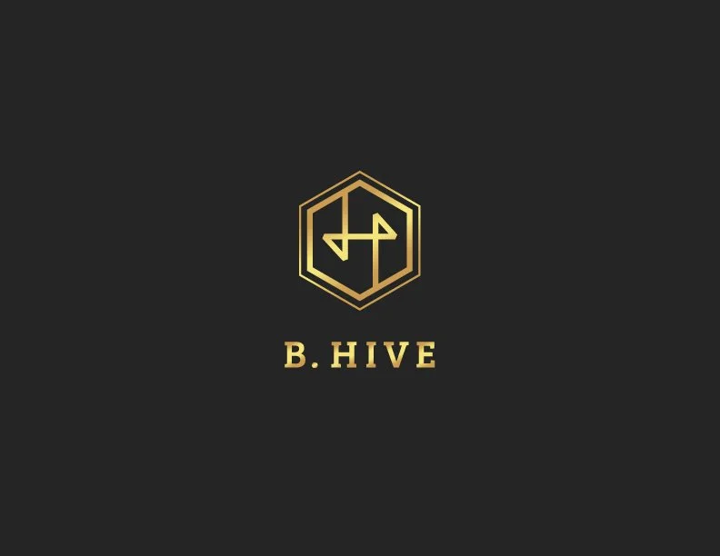
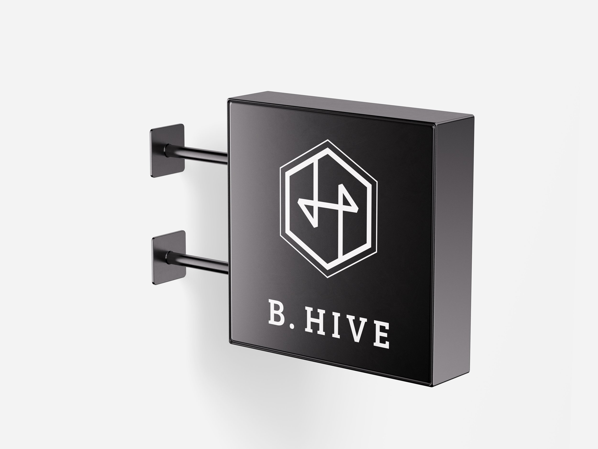
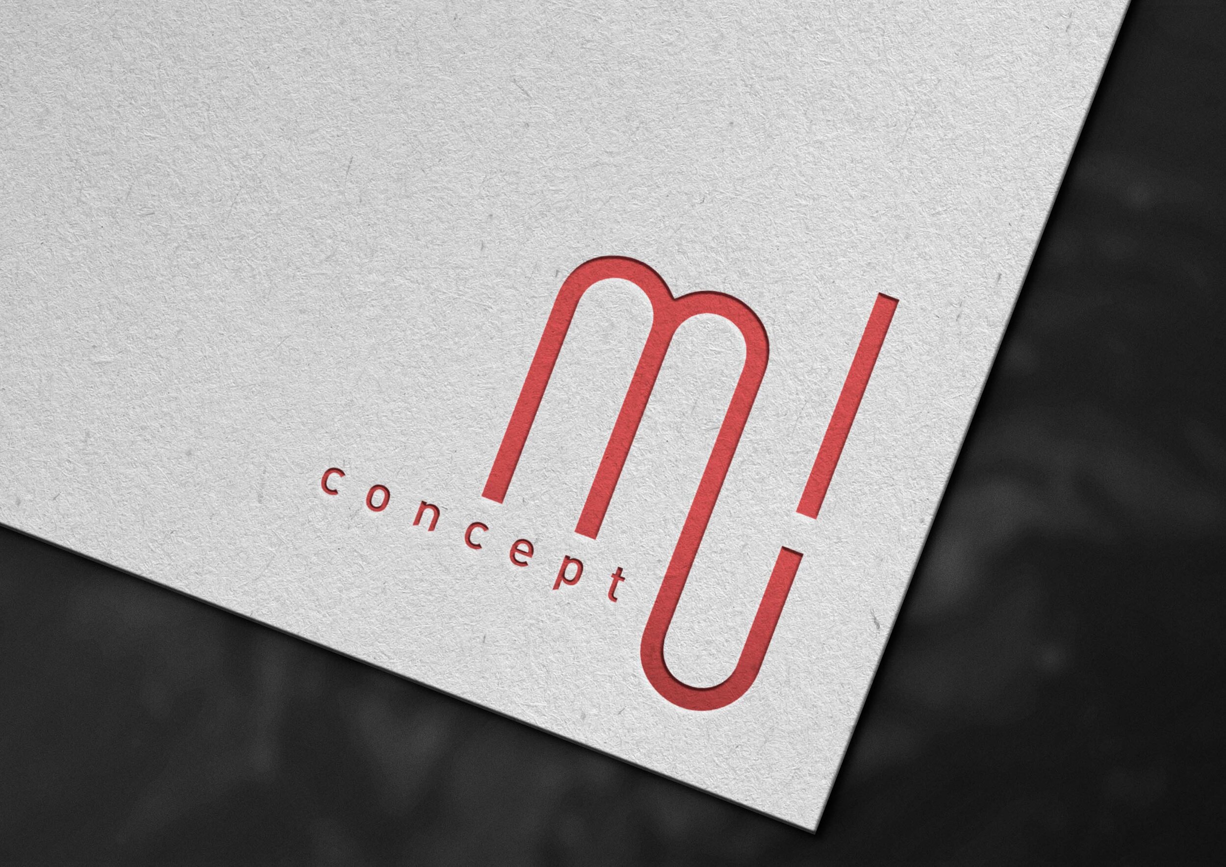
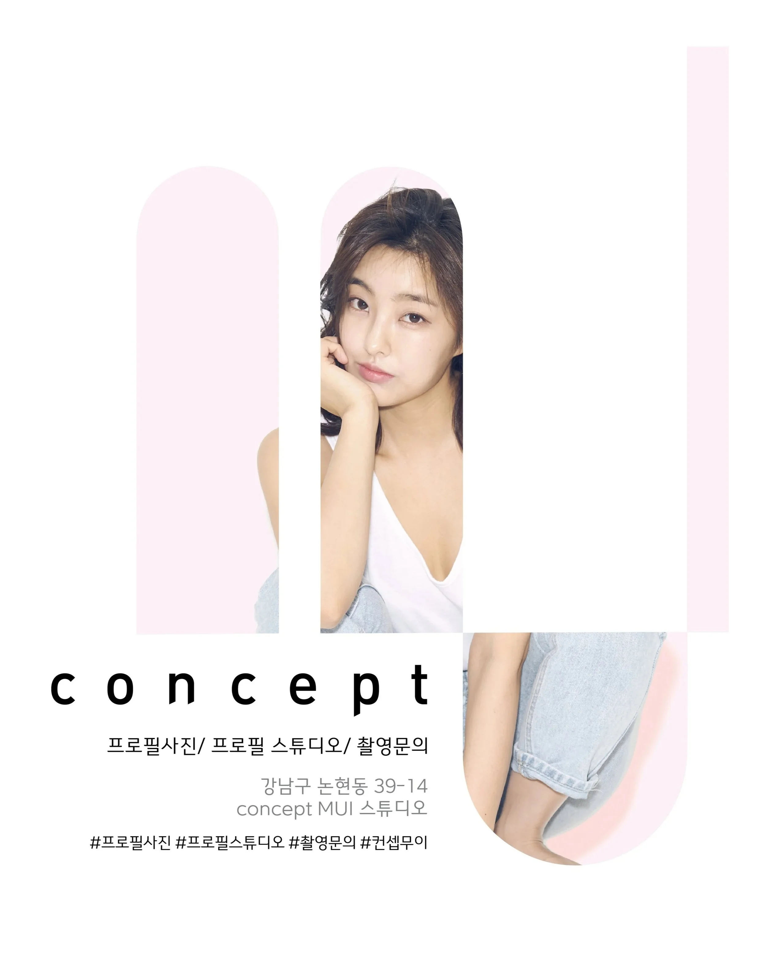
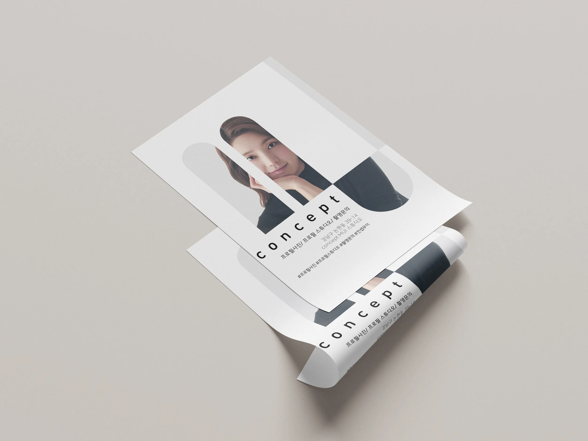
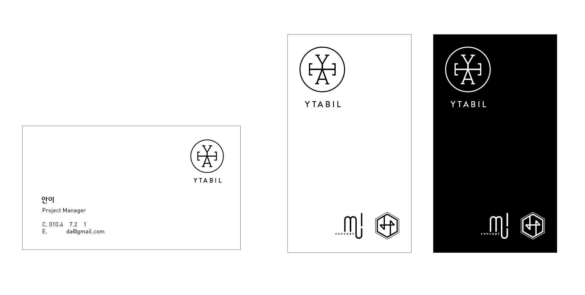
YTABIL Inc. is a Seoul-based creative startup running three distinct ventures under one roof — Concept Mui, a photography studio; YTABIL, an interior design practice; and B.Hive, a coworking space and office. Each business has its own audience and personality, which made the branding an interesting challenge: how do you create individual identities that still feel like they belong to the same company?


Design approach
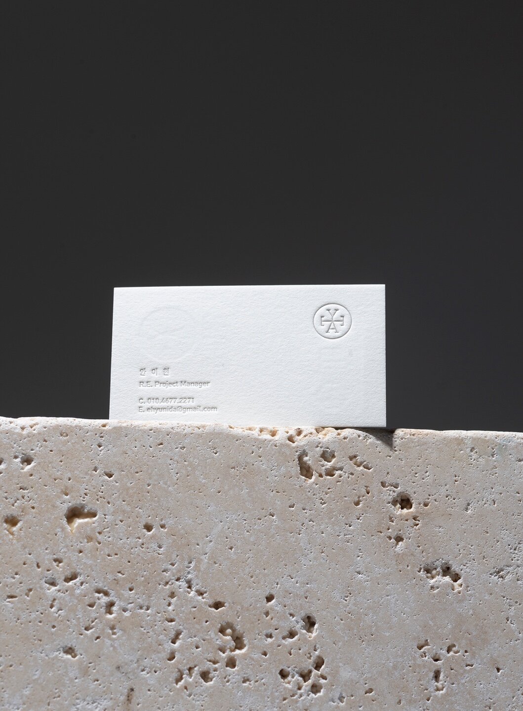
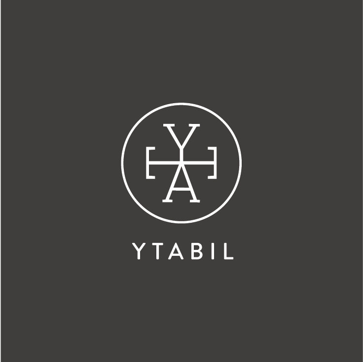
Rather than forcing one visual system across all three brands, each mark was designed to respond to its own audience. The YTABIL monogram — Y, T, and A interlocked within a circle — reflects the precision of interior design and architecture. B.Hive takes a hexagonal form in gold, feeling more structural and premium. Concept Mui steps away from the monogram entirely, using a fluid red logotype with a more editorial quality. What holds them together isn't a rigid system, but a shared sense of restraint and intention.
Process
The main challenge was finding the right balance between differentiation and cohesion. I explored each mark independently before stepping back to assess how they read as a family. Most of the iteration was on the YTABIL monogram — getting the relationship between the letterforms and the enclosing circle to feel balanced without being too rigid.