SLING & GOODBRATHER | Branding Design
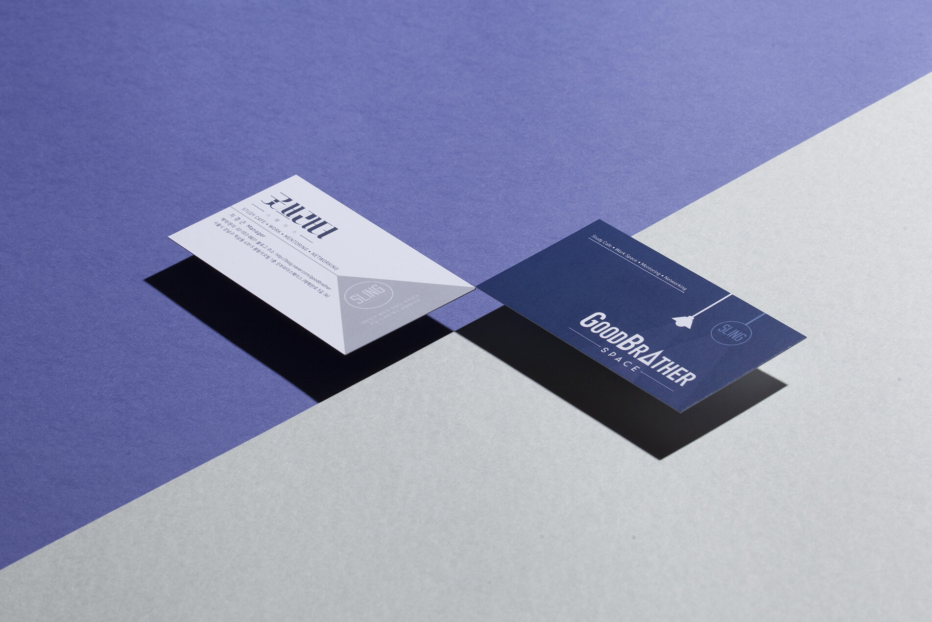
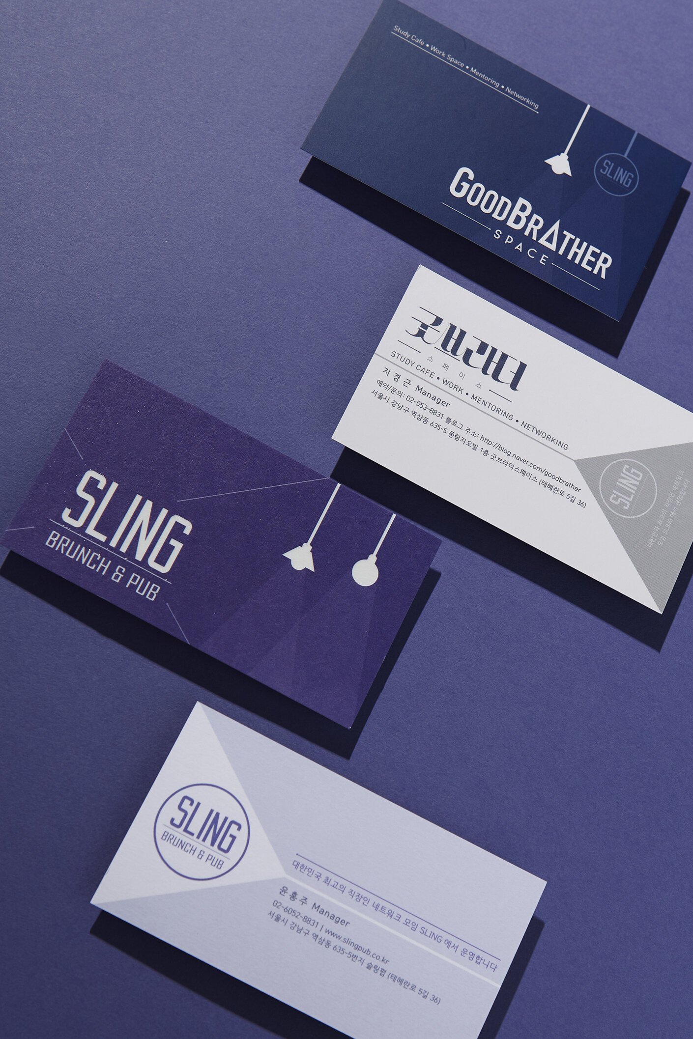
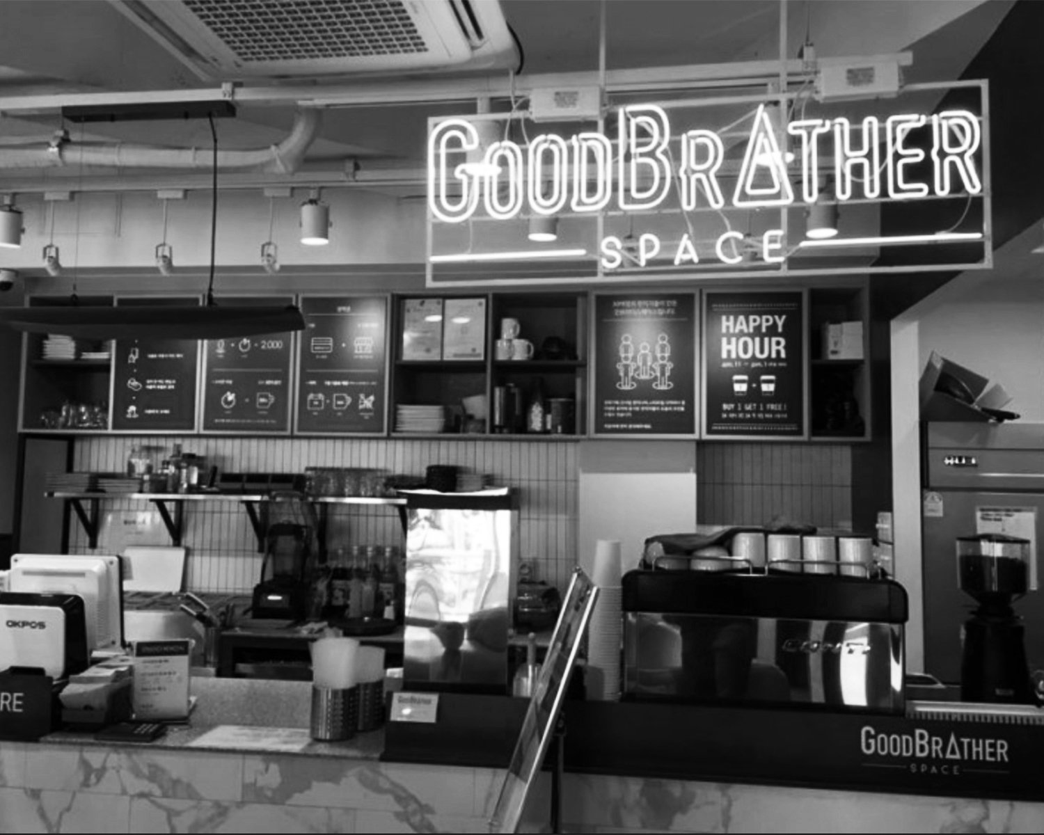
Sling is a well-known Seoul-based community for office workers, built around the idea that meaningful professional connections happen outside the boardroom — and they run a resto-bar at the heart of the city to prove it. This network-first philosophy grew into something larger: GoodBrather Space, a subsidiary brand offering shared workspaces, private offices, and community programs that bridge students with working professionals through learning, mentoring, and networking events. GoodBrather operates across Gangnam and Sinchon — two of Seoul's most dynamic districts — as a multi-use space that belongs equally to the focused student and the professional.
As a Sling member myself, I came to this project with an insider's understanding of the community's character — social but grounded, modern but warm, professional without being stiff. The brief wasn't just to design a name card; it was to carry the spatial mood of the place into print.
Design approach
The navy backdrop on the GoodBrather card was a direct response to the focused, almost library-like atmosphere of the space. The pendant lamp — kept as a minimal line drawing — references the actual fixtures in the interior rather than functioning as decoration. For Sling, I shifted to deep violet-indigo to reflect the warmer, more social energy of the resto-bar, while keeping the pendant motif as a visual thread connecting both brands.
Process
Having been a member of both spaces, I already had a strong sense of the atmosphere before the project began. After exploring a few directions, I landed on the idea of the card feeling like a fragment of the environment itself. Most of the refinement was around calibrating the illustration weight and keeping the back of the card clean without competing with the front. I managed the project end-to-end including print production.