YOUNG YEOL & YEOL MOM | Logo Design
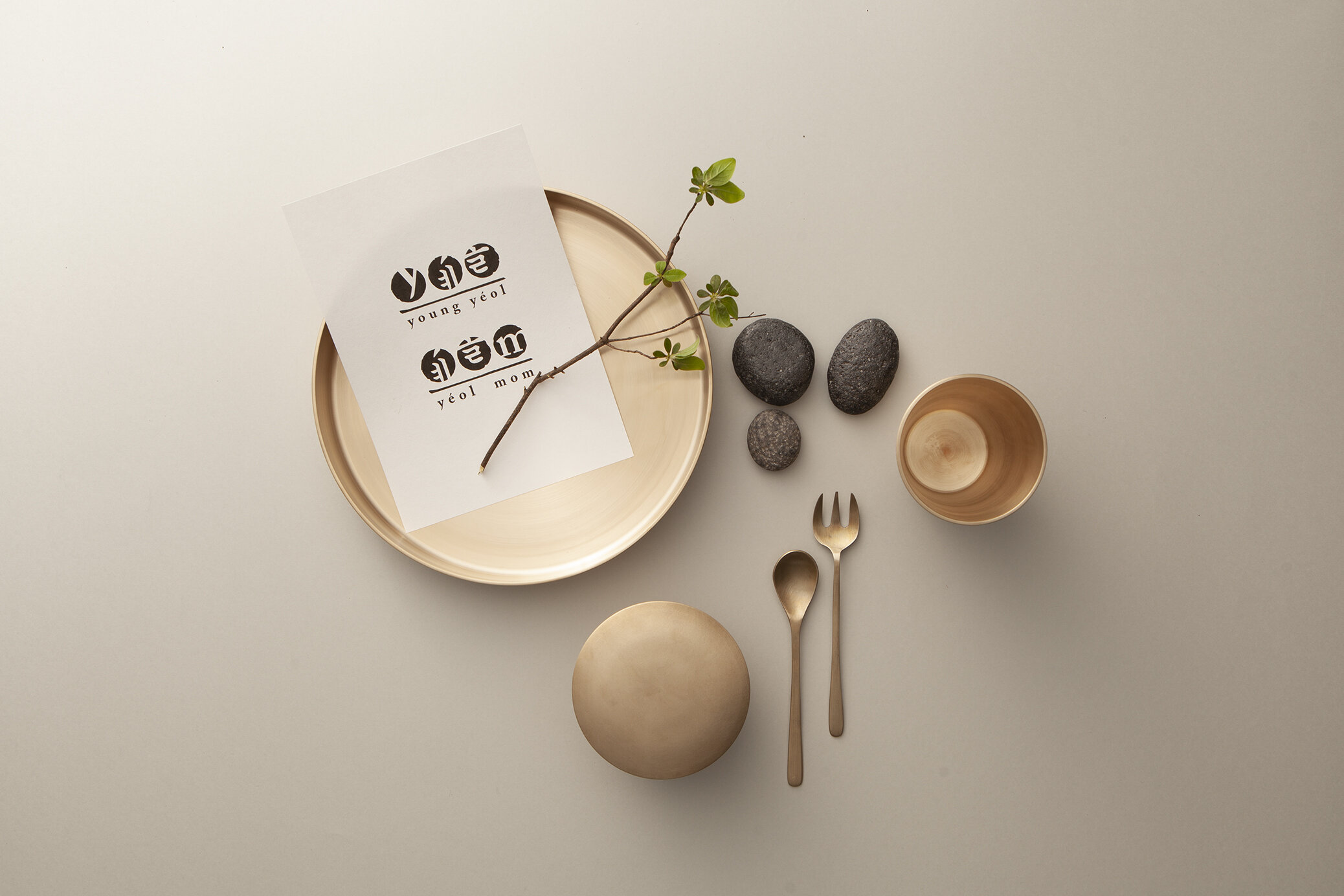
Young Yeol and Yeol Mom are subsidiary organizations of Yeol, a non-profit dedicated to preserving and promoting traditional Korean cultural heritage. Where Young Yeol focuses on engaging a younger audience, Yeol Mom speaks to a maternal, community-driven membership — two distinct groups united by the same mission. The logo needed to honor Yeol's existing identity while giving each sub-brand its own character, and communicate that sense of cultural pride to an international audience as well as a domestic one.


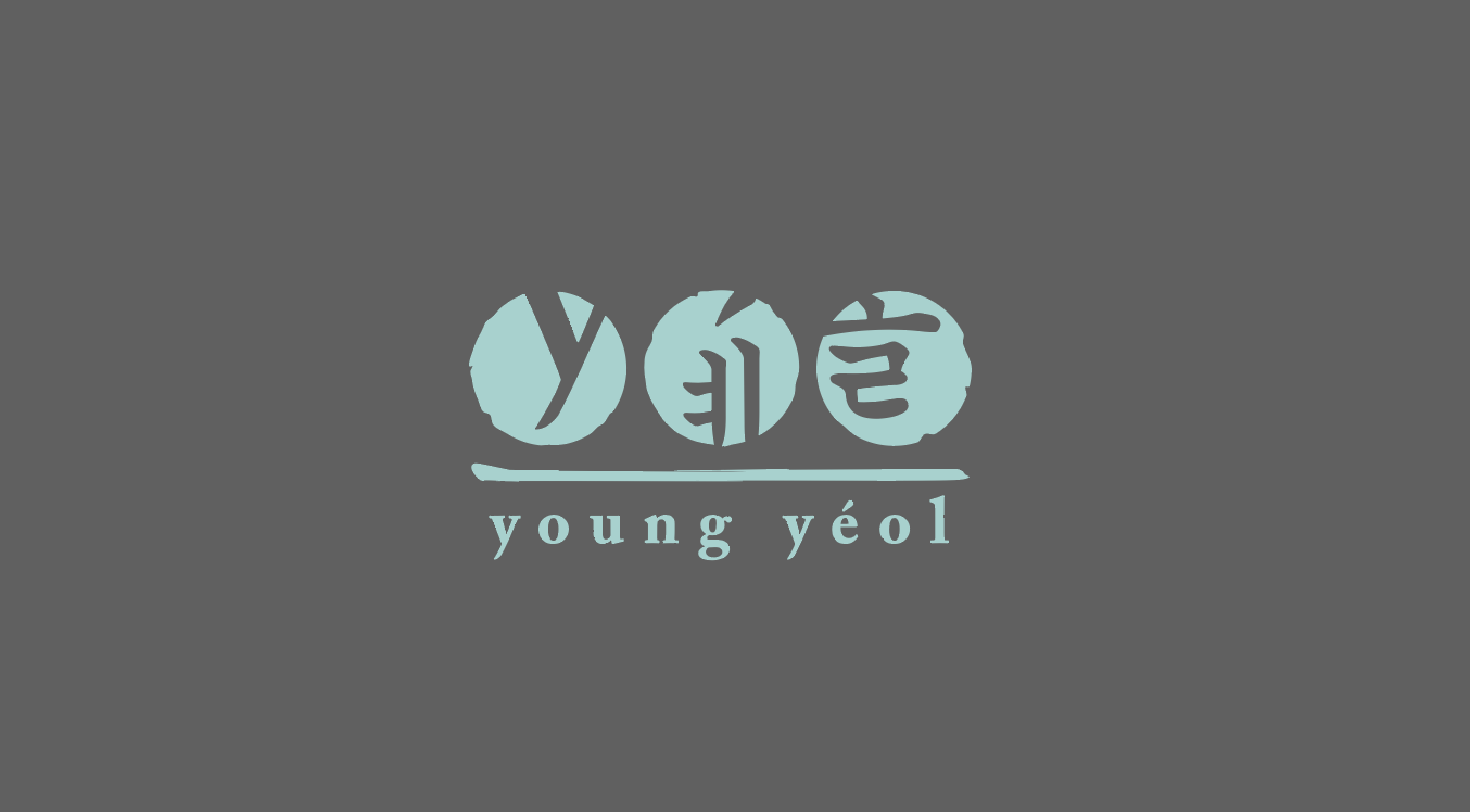
Design approach
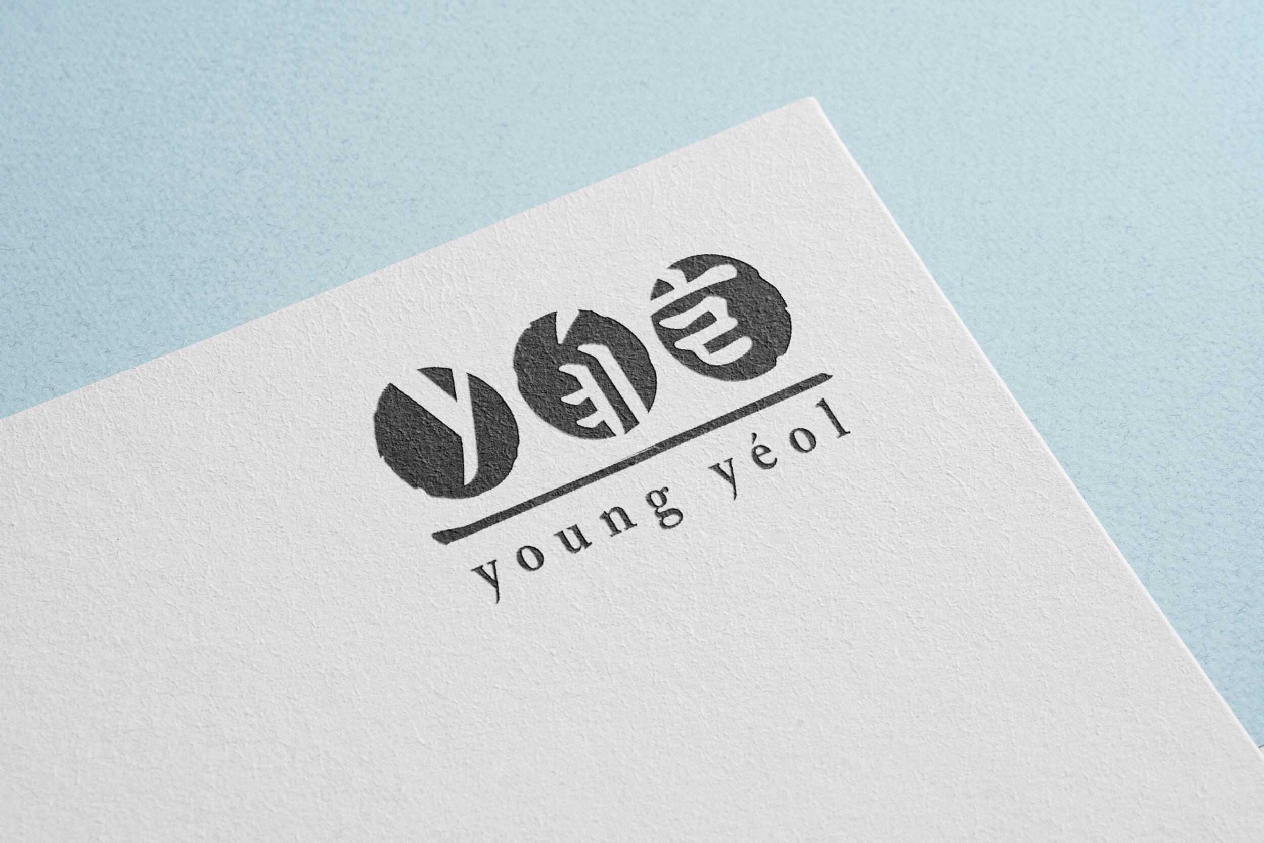
The mark merges Hangul-inspired strokes with the silhouettes of Latin characters — a hybrid that feels neither purely traditional nor purely modern, which was very much the point. The ink-stamp quality adds a hand-crafted warmth that references Korean seal culture, while the clean roman wordmark beneath keeps it grounded and legible. The teal colorway brings approachability and energy without undermining the cultural weight of the mark.
Process
The starting point was studying traditional Korean typography and seal aesthetics to find forms that could naturally coexist with Latin letterforms. The central challenge was making sure neither script overpowered the other — most of the iteration was around stroke weight, circle proportions, and the negative space between characters. Once the core mark felt right, it was adapted for both sub-brands and tested across light, dark, and tonal backgrounds.