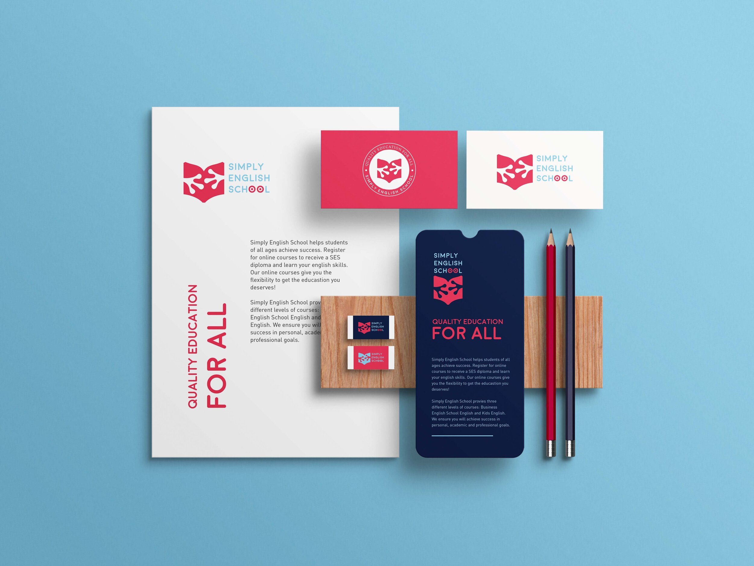
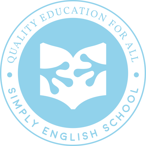
SIMPLY ENGLISH SCHOOL | Corporate Identity-Logo
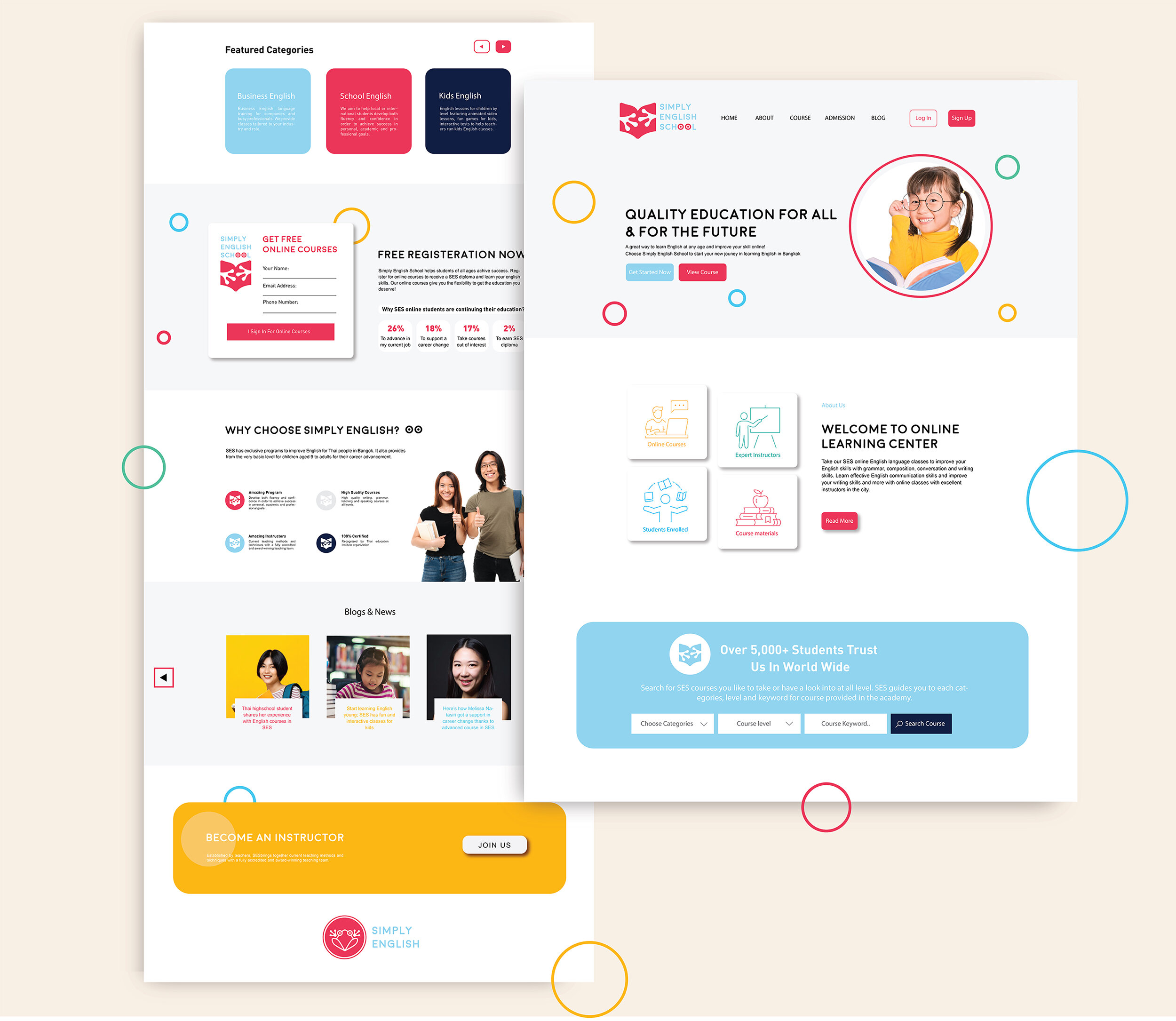
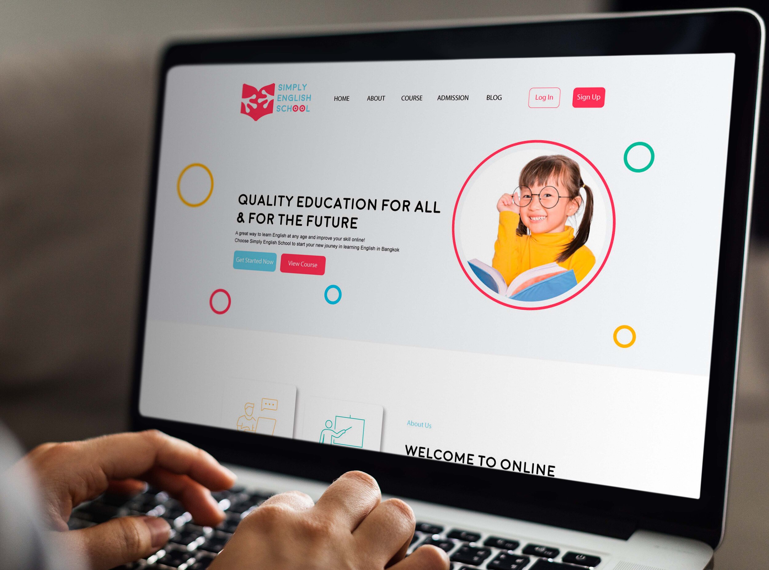
Simply English School (SES) is a private English language school in Bangkok, Thailand, offering courses for students ranging from children aged 9 through to working adults. Their motto — "Quality Education for All" — shaped the brief: the identity needed to feel welcoming and fun without alienating older students, and professional enough to build trust with parents and career-focused learners alike.

Design approach
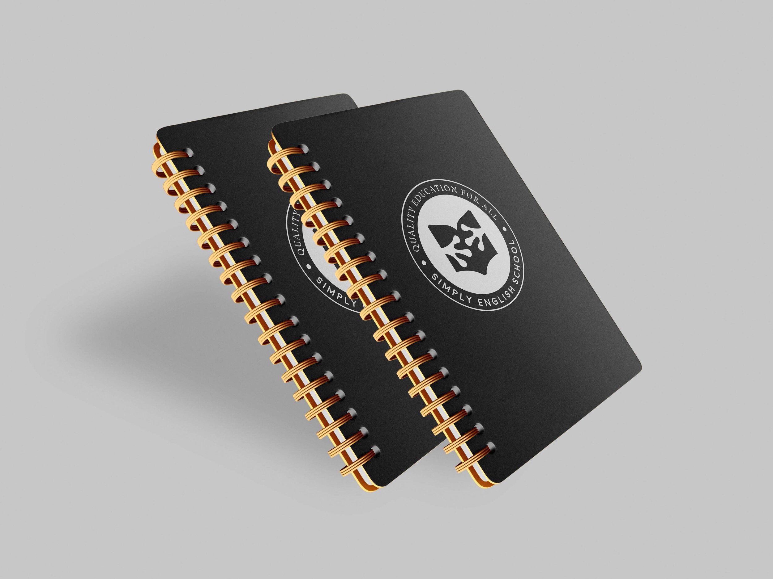
The mark combines an open book with a pair of frog hands emerging from its pages — a playful detail requested by the owner that gives the logo an instantly friendly, memorable quality. It works across age groups because it's warm without being childish, and distinctive enough to stand out in an educational context. The bold crimson and sky blue palette reinforces that balance between enthusiasm and approachability. The frog concept carries through into the wordmark too, where the double O in "School" is replaced by a pair of frog eyes — a small but cohesive detail that ties the whole identity together.
Process
The central challenge was designing something that could genuinely resonate with a nine-year-old and a thirty-five-year-old at the same time. Incorporating the frog element in a way that felt intentional rather than forced took several rounds of iteration — the hands emerging from the book ended up being the most natural solution, tying the playfulness directly to the act of learning. The same identity was then extended to the website, where the color system and typographic hierarchy were developed to keep the experience clear and engaging across desktop and mobile.