WOA & KOA ANNUAL CONFERENCE | Promotional Design
The 2nd WOA Asia/Oceania Olympians Congress brought together National Olympians Association members from across the Asia-Pacific region in Seoul, November 2010. Hosted by the World Olympians Association and organized by the Korea Olympians Association, the two-day event aimed to strengthen communication between NOAs and advance the global Olympic movement.
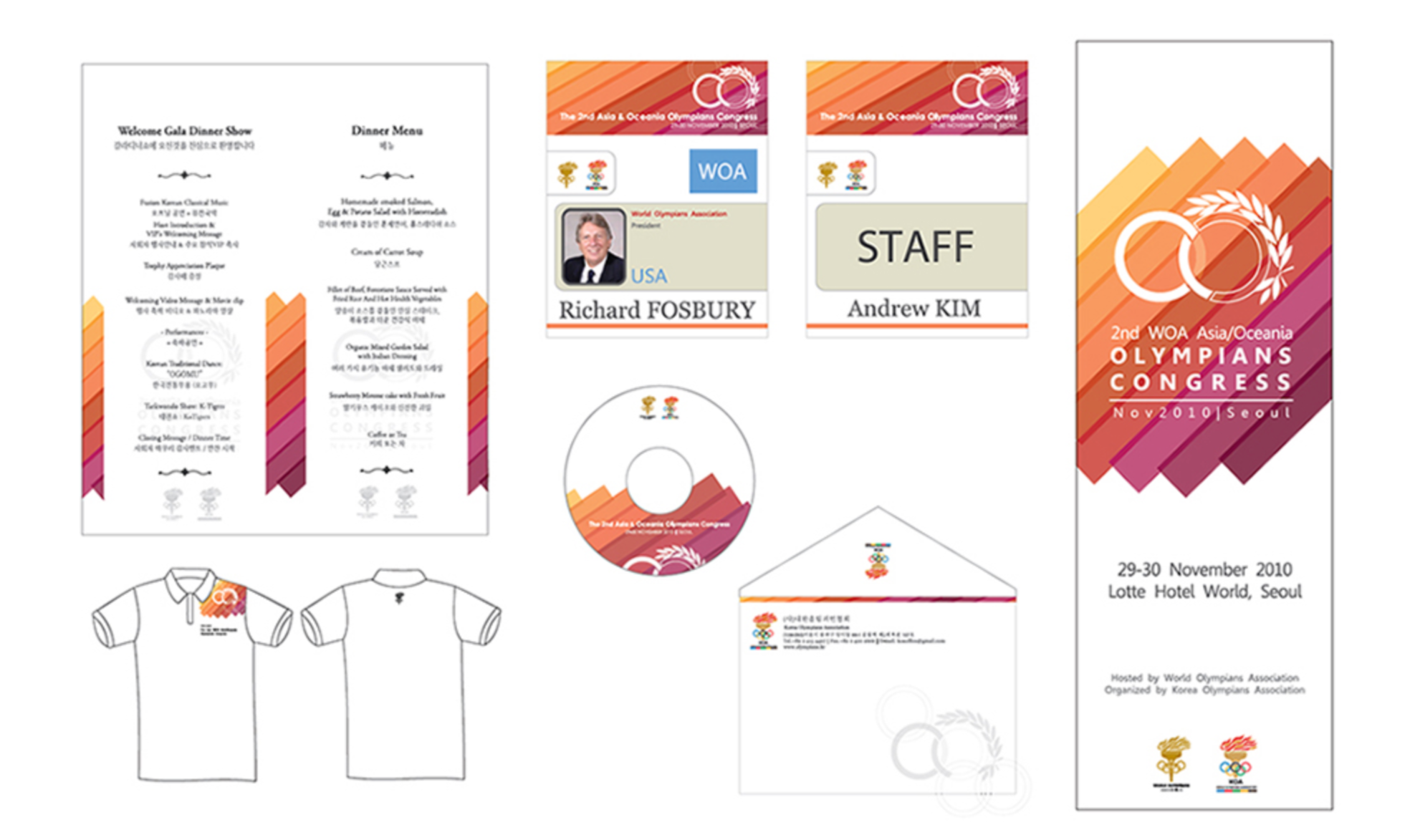
The project covered the full event branding — logo, banners, x-banners, booklet, brochure, invitations, stationery, ID tags, gala dinner program, signboards, and guide maps.
Design approach
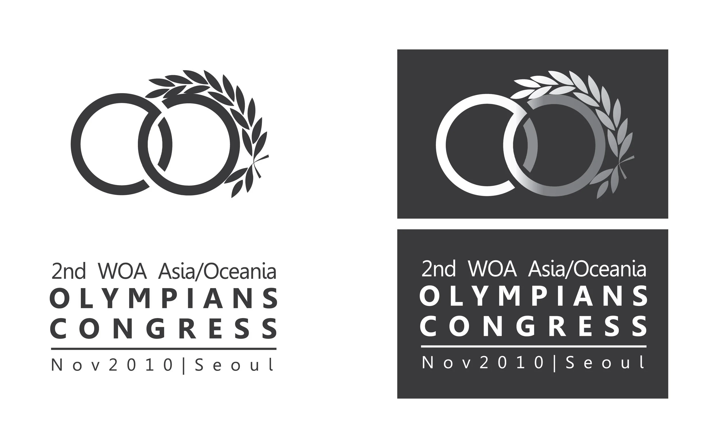
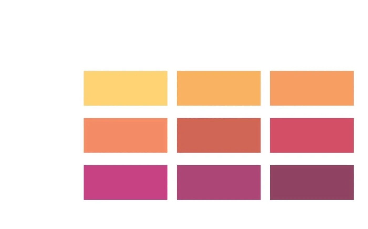
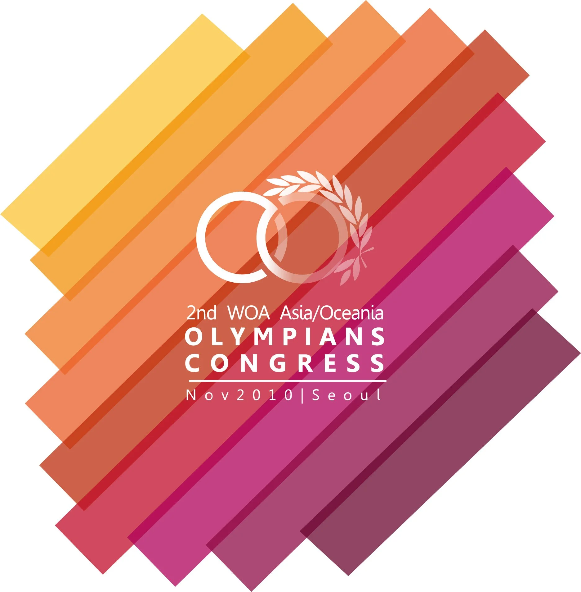
The warm gradient sweeping through yellow, orange, coral, and magenta was chosen to convey energy and celebration, while the layered diagonal bars suggest movement and momentum. The interlocking rings overlaid with an olive laurel branch anchor the identity in Olympic tradition without mimicking the primary Olympic branding directly. The result feels festive and ceremonial — fitting for a high-profile international congress.
Process
The gradient system was established early as the unifying thread, making it easier to maintain visual consistency across a wide range of applications — from intimate print collateral like menu cards and ID tags to large-format pieces like stage backdrops and banners. Each deliverable was adapted from the core identity with attention to how the diagonal composition translated across different formats and scales.