PEPSI ORGANIC | Branding & Packaging
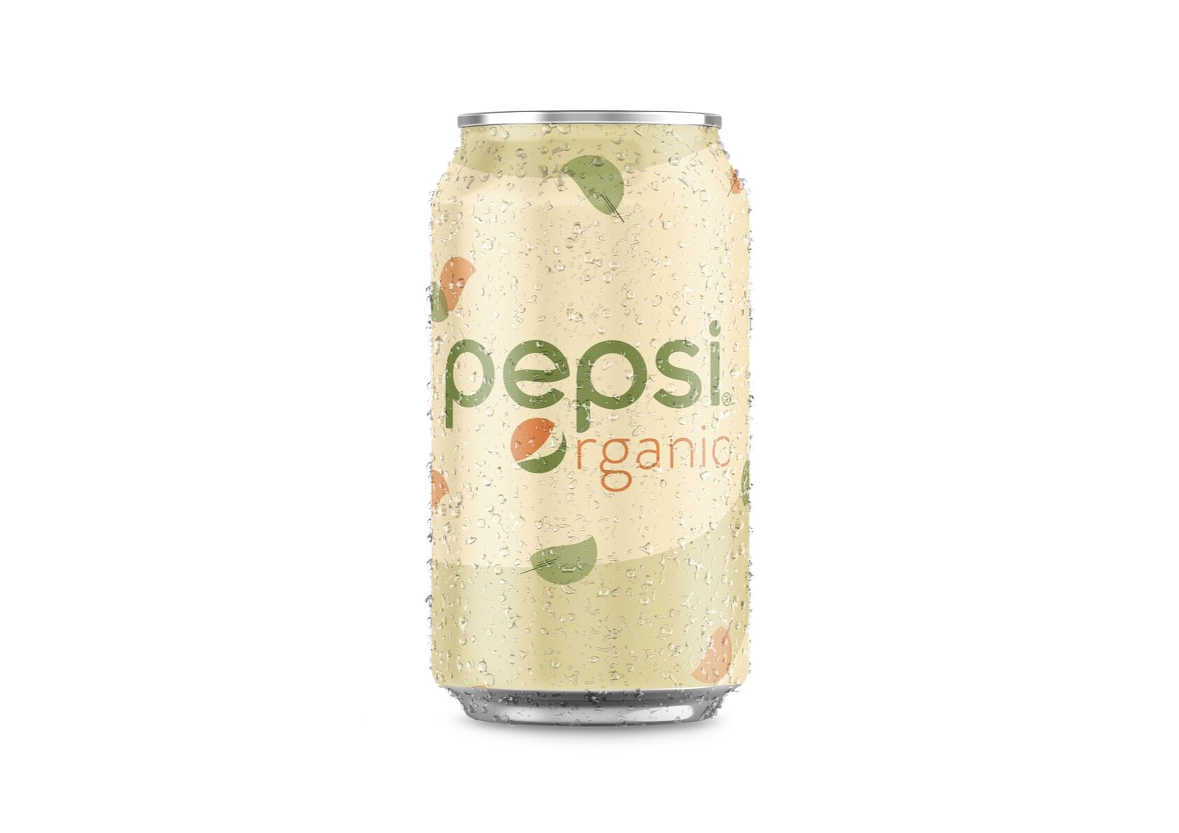
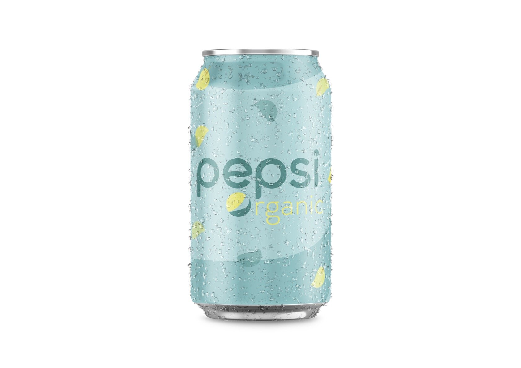
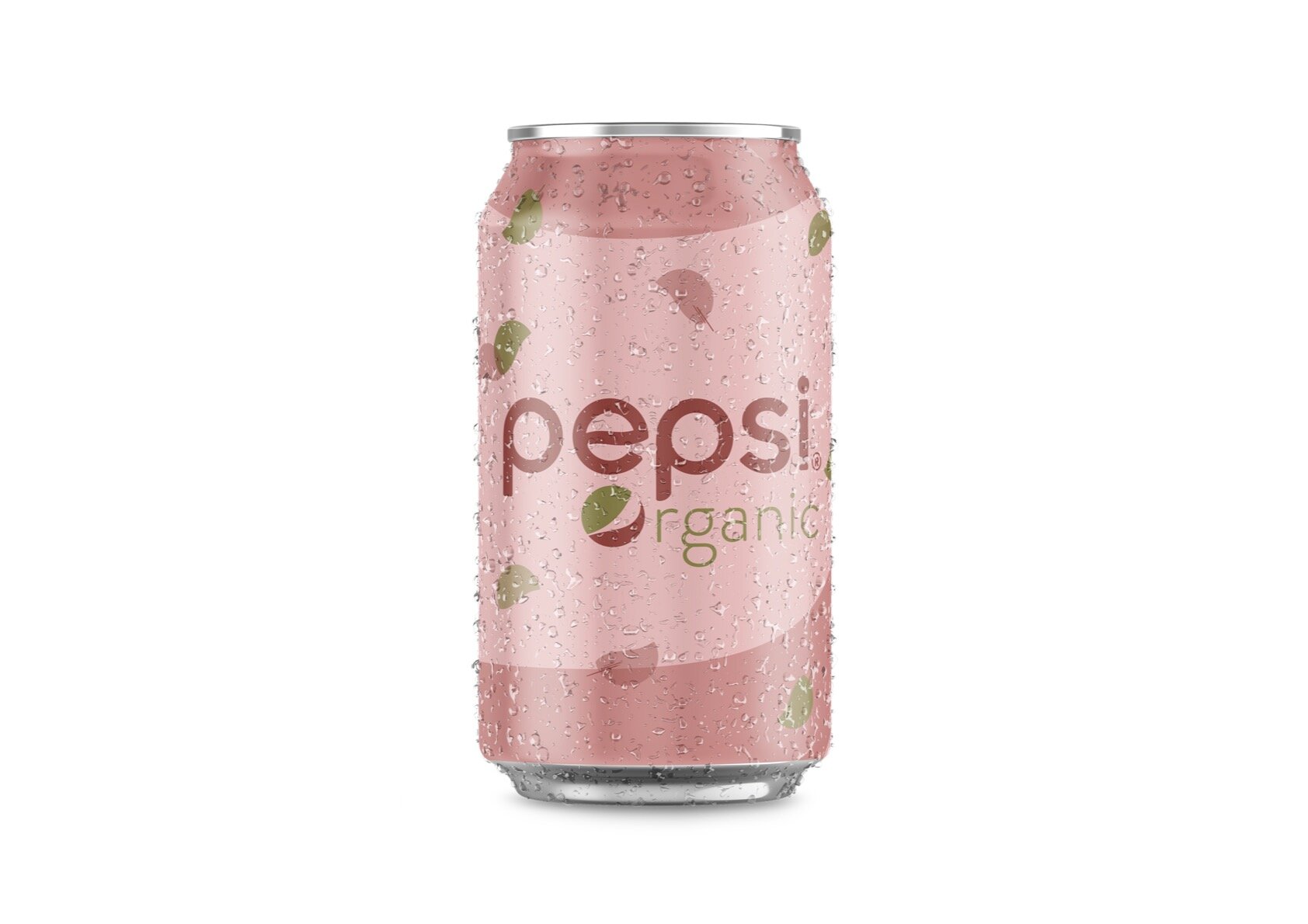
A concept project reimagining Pepsi as an organic beverage line — three new flavors (lime & blueberry, celery & carrot, and pomegranate & papaya) designed to sit within the Pepsi family while communicating something genuinely different. The challenge was signaling "organic" and "healthier" without losing the brand recognition that makes Pepsi, Pepsi.
Design approach
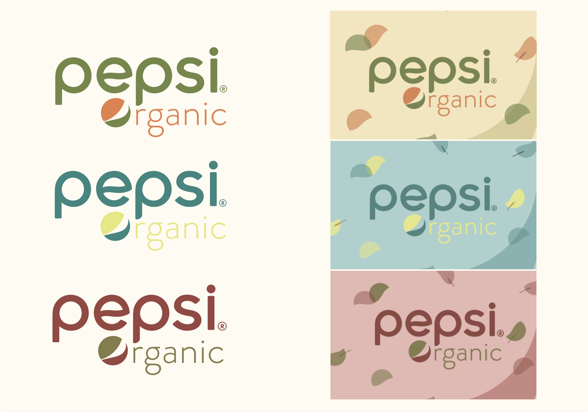
The Pepsi logotype is retained but redrawn in nature-inspired tones — earthy greens, warm oranges, and muted rose — stepping away from the brand's signature blue without losing familiarity. The Pepsi globe becomes a leaf, bridging the original mark and the organic concept in a single gesture. Each flavor gets its own muted can — soft yellow, dusty teal, and blush pink — unified by a floating leaf pattern that adds organic texture without feeling too literal. The result sits closer to a wellness brand aesthetically, while the Pepsi wordmark keeps it recognizable.
Process
The central tension was between heritage and reinvention — pushing the visual language far enough to feel organic, without the product becoming unrecognizable on shelf. Most of the refinement was in the color palette, finding the right balance between muted and appealing. Once the can design was settled, the system was extended to retail display and poster to make sure the identity held together across all contexts.


